Fashioning
Scale.
Orchestrating the UX strategy to fuel Westside's journey toward the 500 Cr Revenue Milestone.
Live System Status: Active
Forensic
Audit.
We didn't just look at UI; we audited the logic. Using Microsoft Clarity heatmaps, Shopify & Google Analytics, and over 100+ Play Store & App store reviews with User testing, we identified the specific friction points bleeding revenue.
Discovery Paralysis & Search Failure
The Issue: High bounce rates on the homepage due to information overload, non-predictive search, and cluttered navigation.
The Friction: Filter lags and poor tap zones on mobile made product listing pages (PLP) unusable. Users were overwhelmed by visual noise with no clear engagement paths.
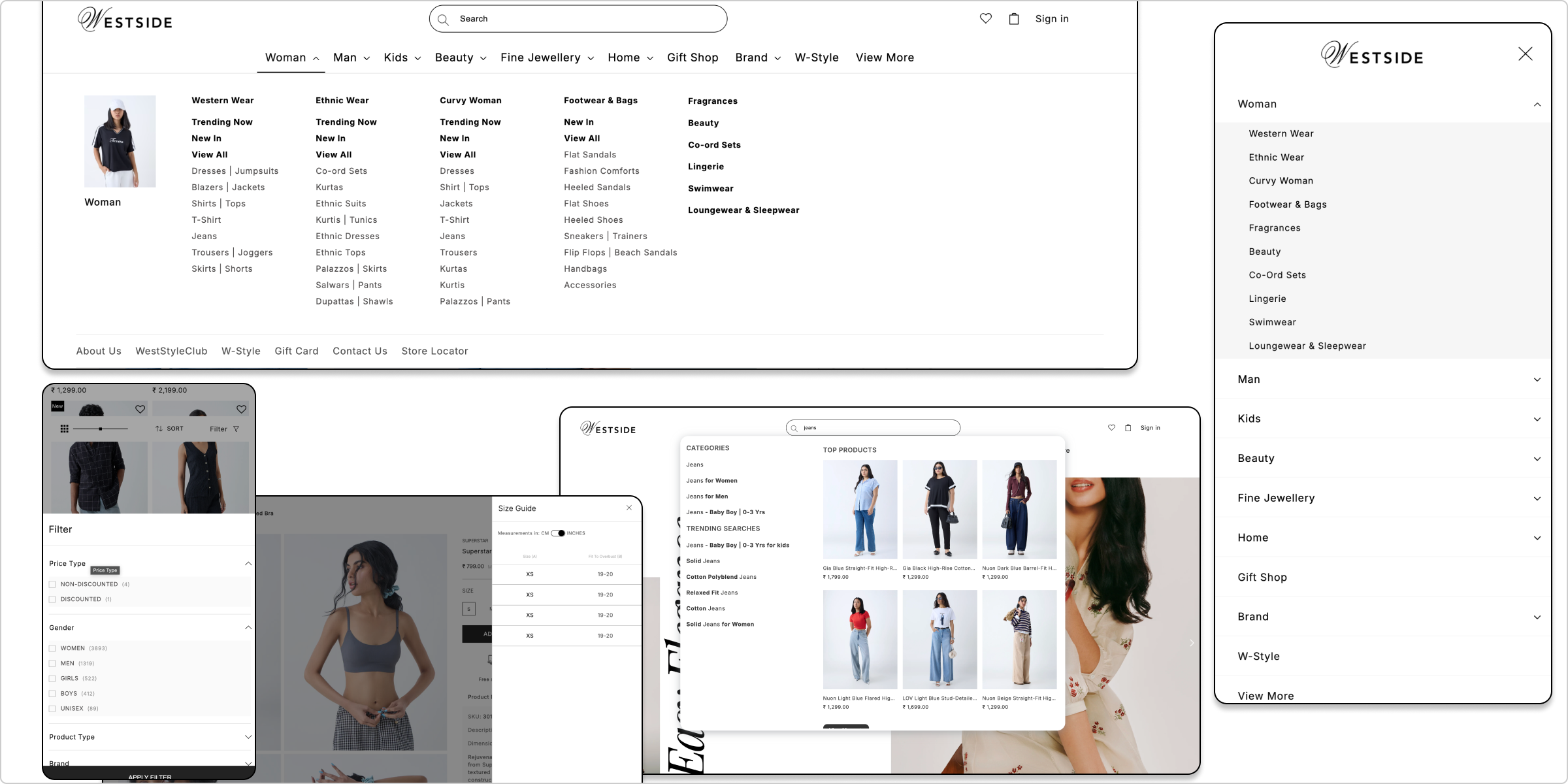
Critical Logic Gaps (Cart & MOV)
The Issue: Trust erosion due to "Late Communication."
The Friction: Users were only told about the Minimum Order Value (MOV) after reaching checkout, causing rage-quits. Combined with critical cart management bugs, the "Add-to-Cart" rate was suffering.
The Checkout Dead-End
The Issue: High cognitive load and invisible CTAs.
The Friction: The checkout flow was a literal dead-end with broken navigation logic. Post-purchase, refund and order tracking systems were buried, driving up support tickets. We needed to fix the flow from "Payment" to "Refund."
Designing for Revenue.
We moved beyond "making it pretty" to "making it perform." We implemented specific psychological triggers and functional upgrades to boost Average Order Value (AOV) and conversion rates.
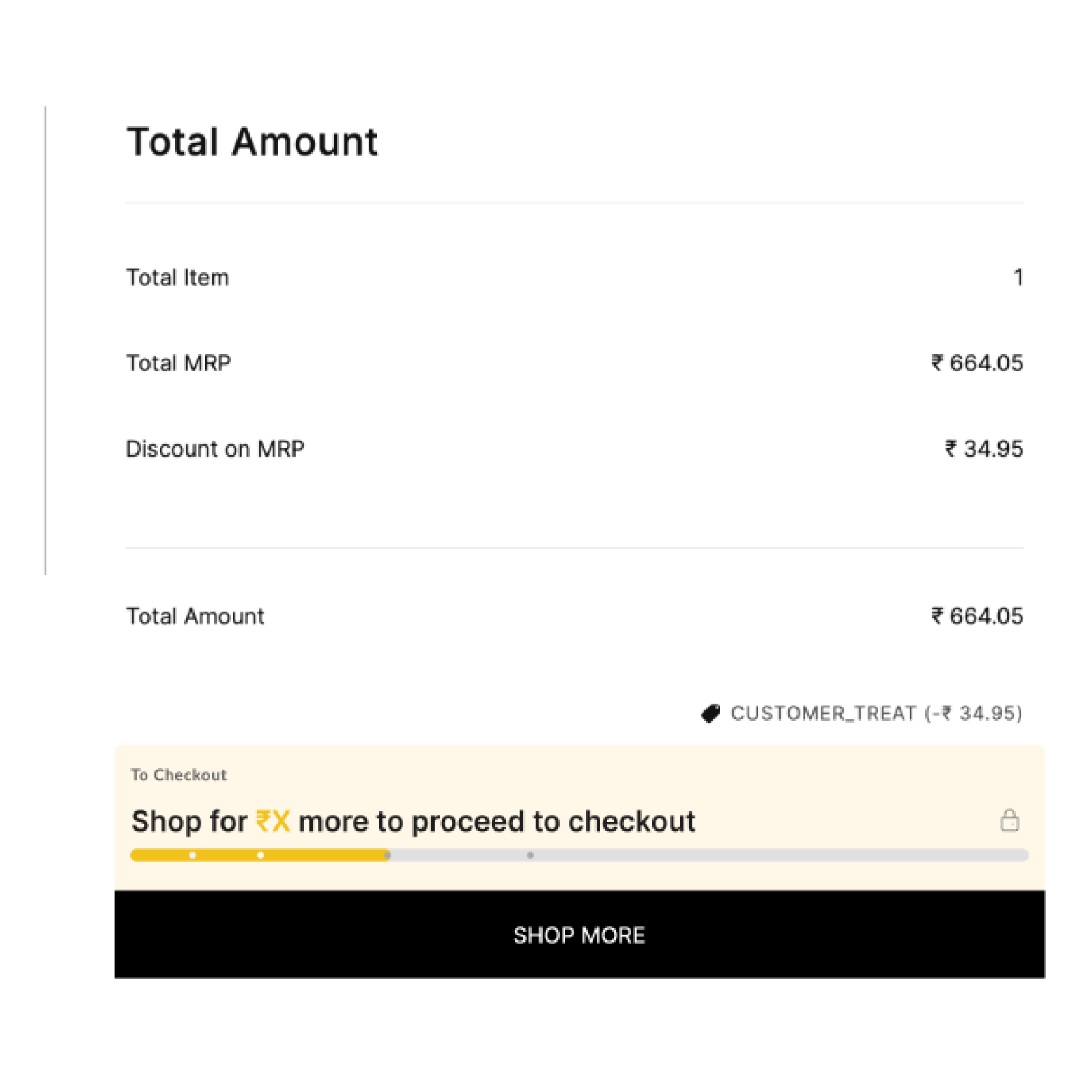
Gamifying the Cart
To increase AOV, we introduced a progress bar in the cart: "Shop for ₹X more to proceed." This simple gamification nudge significantly lifted basket sizes and reduced MOV friction.
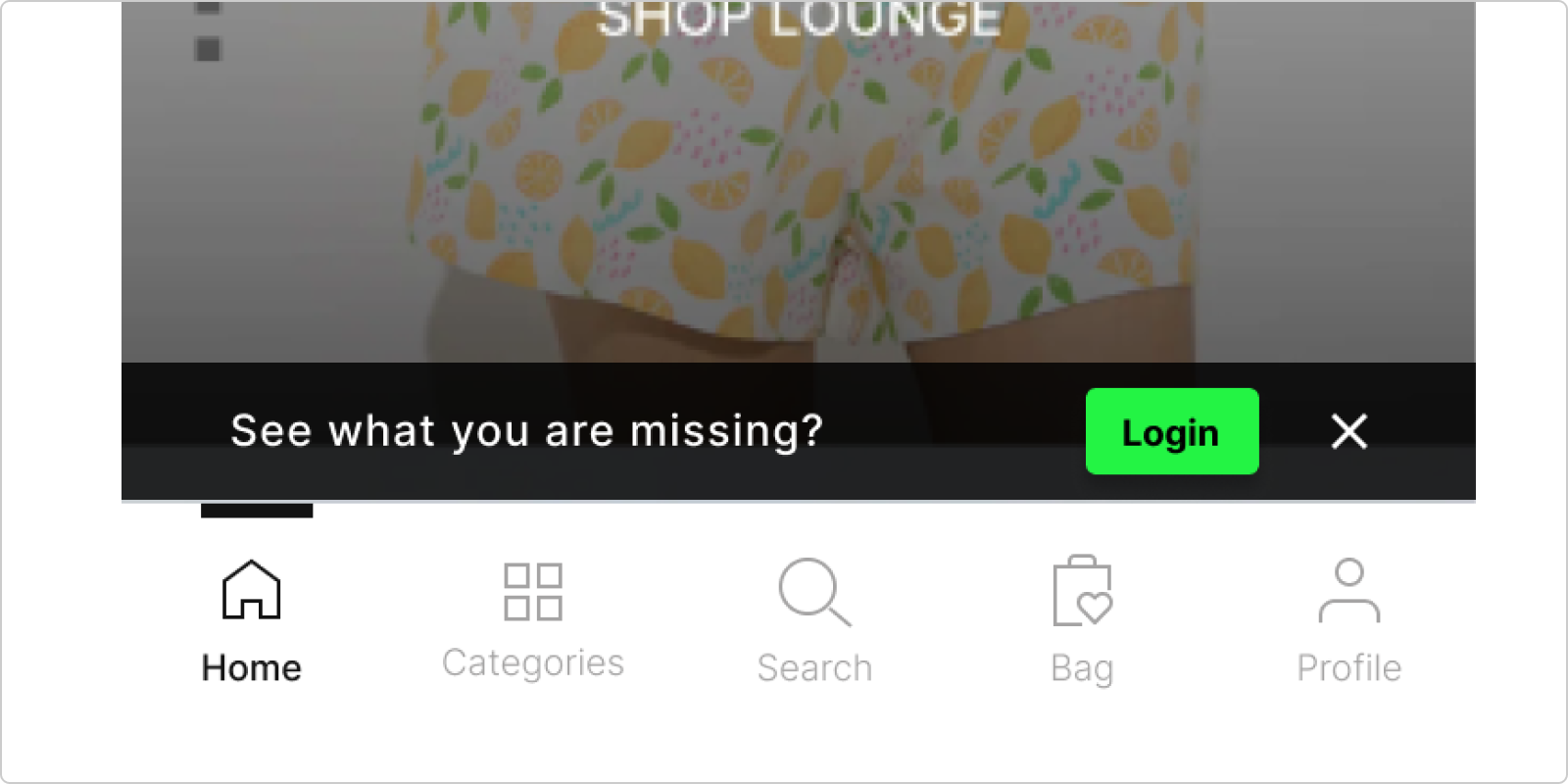
Guest -> Member
Strategically placed login prompts with "Member Price" incentives converted guest users into registered database entries.
Core Funnel Revamp
We overhauled the entire purchase path. Visual navigation replaced text links, PLPs got cleaner filters, PDPs highlighted sizing, and Checkout was streamlined to 3 steps.
WestStyle Club
We redesigned the coupon experience. Instead of hiding codes, we made them "Opt-in" with one tap. This transparency built trust and increased redemption rates.

The Luxury
Expansion.
Westside needed a home for its premium labels (Samoh, Pome) without cluttering the mass-market interface.
The UI Solution: "The Portal"
We architected a "Store-within-a-Store" accessible via a dedicated Bottom Drawer Toggle. This micro-interaction acts as a portal, triggering a sophisticated transition animation that switches the entire app context—fonts, colors, and layout—to "Luxury Mode."
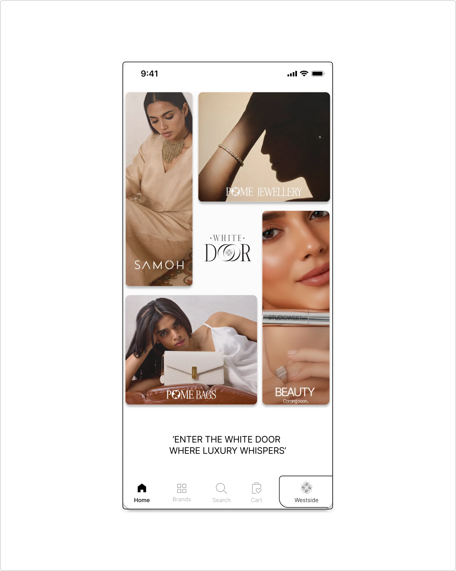
The Architecture
Designed the parent ecosystem "Whitedoor" to house multiple luxury verticals. The UI removes the clutter of standard e-commerce, using negative space to let the premium products breathe.

Pome
Fine Jewellery & Bags
Pome: Visual Storytelling
For the Pome Category Landing Page, we moved away from grids. We used editorial-style "Lookbook" layouts with macro photography and subtle scroll-triggered animations.
Samoh
Apparel > ₹10k
Samoh: Strategic Integration
Strategically integrated Samoh’s standalone premium catalogue into the Whitedoor ecosystem, allowing Westside users seamless access to high-value occasion wear.
Bridging the
Technical Gap.
The biggest challenge wasn't design; it was execution. The IT team struggled with complex modern layouts. Instead of compromising quality, I stepped into a Design-Led Engineering role.
-
Code as a Deliverable
I didn't just send PNGs. I wrote and handed off HTML/CSS and react snippets for complex interactions, ensuring the live site matched the Figma pixel-perfectly.
-
Rigorous QC Rituals
Instituted a "Weekly Design QC" phase. We logged bugs in trackers and sat with developers weekly to resolve them, prioritizing function over form.
-
Westside Wallet
To fix post-purchase frustration, we designed the Westside Wallet for instant refunds, turning a pain point into a retention feature.
 .westside-card {

  display: grid;

  grid-template-columns: repeat(auto-fit, minmax(200px, 1fr));

  gap: 1.5rem;

}

 // I provided code to ensure grid responsiveness worked perfectly.
100%
Design Consistency Achieved
Fueling the
Revenue Engine.
Revenue Goal Roadmap
Drop in Support Tickets
New Brands Launched
Stakeholder Buy-in
Orchestrating the "Village"
Delivering at this scale required aligning diverse stakeholders - Brand, Marketing, Customer Communication, and our vendor partners. My role shifted from "creator" to "diplomat," ensuring design intent survived the boardrooms and development tickets.
Mentorship as a Multiplier
Managing a team of 4 designers taught me that my output is no longer my pixels, but our team's collective growth. By setting up design systems and clear BRD processes, I empowered our team to own impact verticals independently.